Emails have become the digital passports that grant us entry to different parts of the internet. As per a Radicati survey, the current number of email users worldwide is around 3.9 billion, and is expected to grow at a rate of 4.4% yearly. If you are someone who offers digital services, sells products online or operates a brick-and-mortar store with an online presence, there is a chance for you to connect with your prospective customer through their email address.
Email marketing has become a great way to engage with your prospective customers while aiming to convert them. In this dream-like perfect scenario, there is a significant roadblock at the beginning itself. You need to build your mailing list by targeting your ideal target audience with optimum lead list building activities.
In this article, we will be teaching you about what an effective email signup form looks like, how to create Mailchimp signup forms, and showcase some effective examples.
Characteristics of an effective
email signup form
A signup form is not just a series of form fields that a prospect fills out and forgets. Multiple factors affect the performance of an email signup form. A well-converting email sign up needs to have the following properties:
Value Addition
When someone lands on your website, they are in search of solutions to their problems. Instead of simply collecting information from them, your form should explain or highlight the value addition on subscribing. The value addition can be information, discount coupon, or any other lead generation resources. By providing an appropriate answer to the prospect’s question, “What’s in it for me?” you build enough trust for them to enrol in your emails.
Pack a Powerful CTA Punch
As the term suggests, a call-to-action should call the visitor to take action. In conjunction with the value addition, as mentioned above, the call to action copy needs to explain how the visitor will benefit by signing up. This means that instead of using generic terms such as “subscribe” or “sign up,” using more powerful and actionable statements like, “Get my free ebook!”, “Start my 14-day trial,” or “Add me to your mailing list.” is more effective.
Consistent Branding
Your signup forms are a part of your website, landing page, or blog posts, and they are the personified version of your brand. So, the signup form should carry the personification. This means the signup should also use the fonts, colors, and tone specified in your brand guidelines.
Keep it Simple
Your email signup should aim only to make the visitor sign up and not register. Don’t require your potential subscribers to enter their name, hometown, favorite color, and beverage of choice to subscribe to your email list. Keep it simple. Ask for an email address. You can gather more information about your subscribers down the road.
Placement
The placement of the email signup form is a controversial topic in the marketing field, with many marketers picking sides. The form needs to be prominent for the prospects to sign up for your emails. The placement may alter depending on the type of email signups (explained later). Some of the prominent places to display a signup form are:
- Static sidebar
- Webpage footer
- Top navigation bar
- As a pop-up
Types & Examples of Email Signup Forms
Overall, there are four different types of email signup forms:
Pop-Up Forms
As the name suggests, this type of signup form tends to ‘pop-up’ depending on a pre-determined trigger. The trigger can be either time spent on the page, % of the page scrolled, or on intent to exit. This type of form is an overlay over the page, and the pop-up will draw attention without being intrusive.
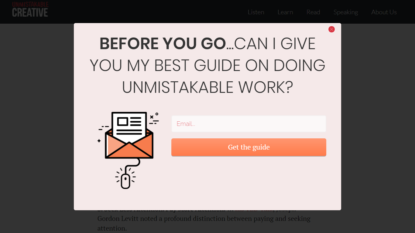
Unmistakable Creative, in the example below, has the signup form pop-up as soon as you intend to exit from the page. The banner copy is quite humble, sounds very conversational, and convinces the visitor to take action.
Static Forms
Static forms tend to be restricted to any of the sides of the screen and are sticky. This means the form remains visible to the visitor even when scrolling through. These are less intrusive and have more chances of converting, however they can restrict the amount of information you can provide and/or inquire.
Fullscreen Forms
Fullscreen forms are the most controversial type of sign up forms. While many find them to be too distracting, they offer the most screen space and are impossible to miss.
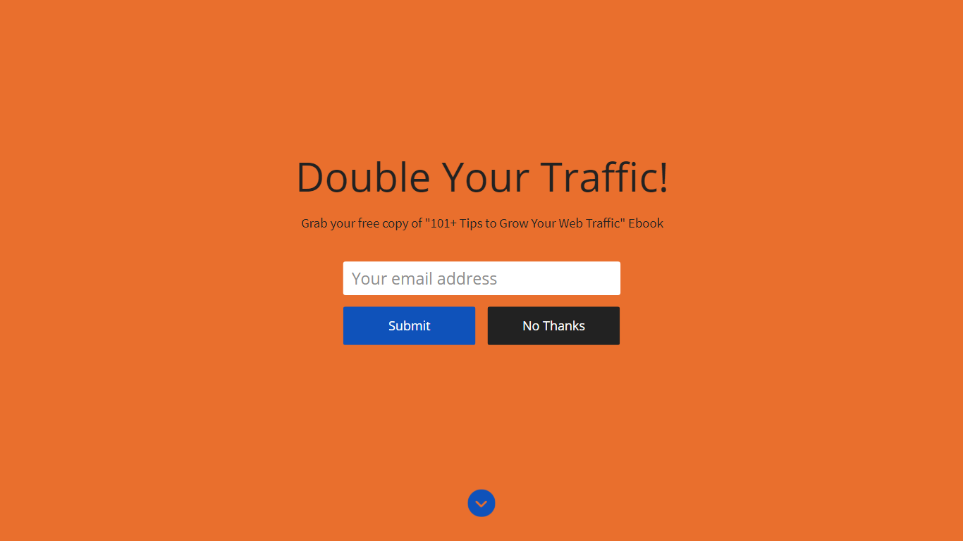
When visiting jeffbullas.com, you are immediately greeted by the fullscreen signup form that uses a hard-hitting headline and supporting sub-headline to motivate the visitor to sign up.
Embedded forms
Embedded forms are signup forms that are a part of your webpage or blog. Integrated forms can be placed on any section of your webpage by inserting code in the correct place.
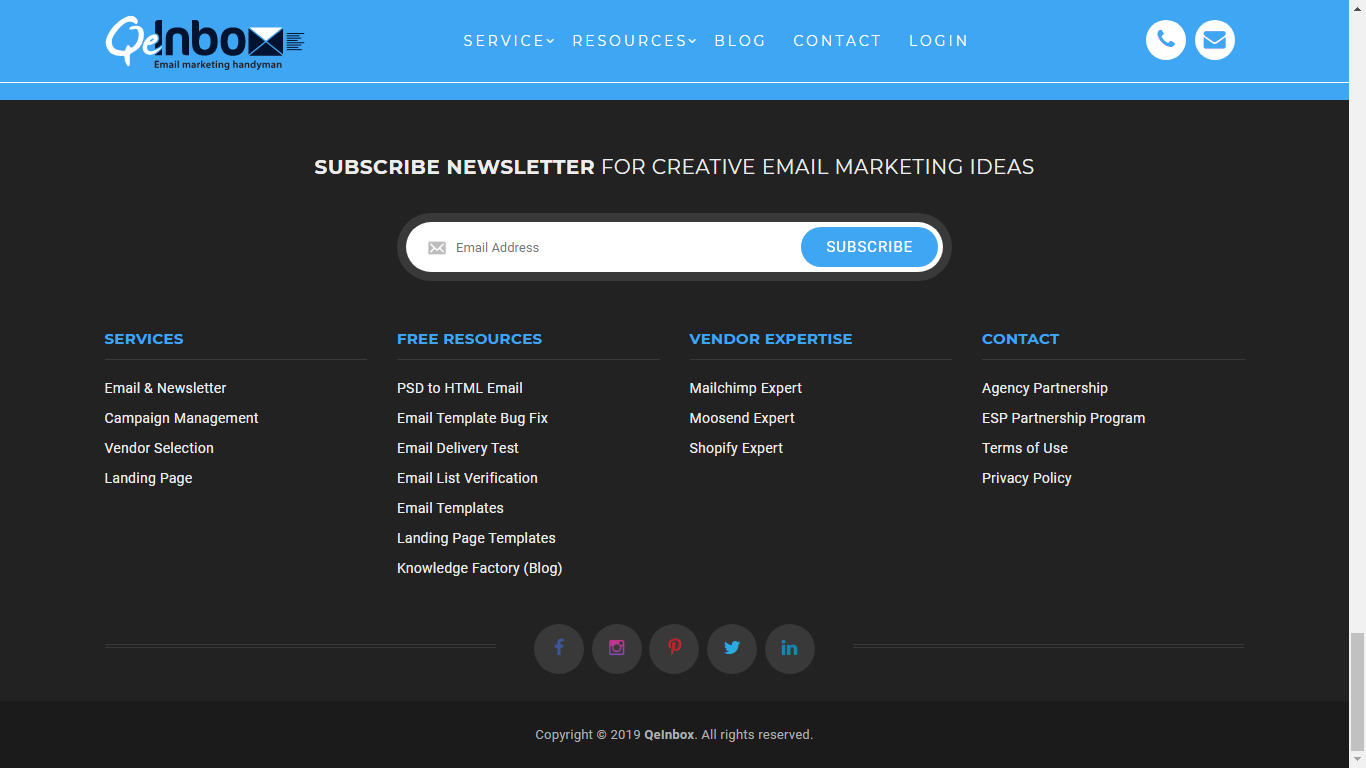
In the example below, we have a prominent form at the bottom of QeInbox’s blog homepage as well as individual blog posts to increase newsletter signups.
Dedicated Landing Page
When you create a webpage that revolves around the theme of the email signup, you have a dedicated landing page. Having a dedicated landing page for email signups is a great marketing tool since you have enough space to convey your message. In addition, the visitors landing on the page is an indication of their level of interest.
How to Create Mailchimp Signup Forms
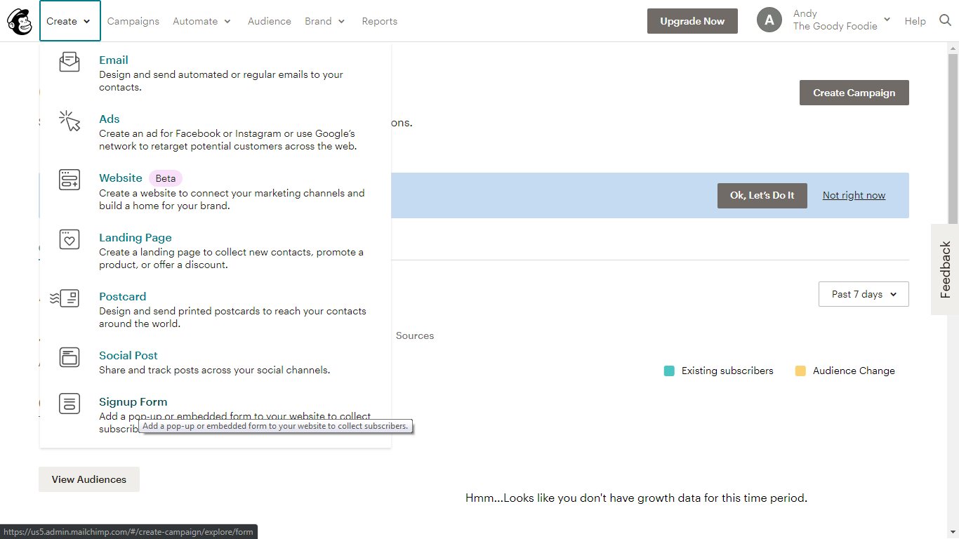
Step 1: Click on ‘Create’ on the top left navigation and select “Signup Form” from the dropdown menu.
Alternatively, you can create a signup form for an existing list. Open the list and click on the “Signup forms” section.
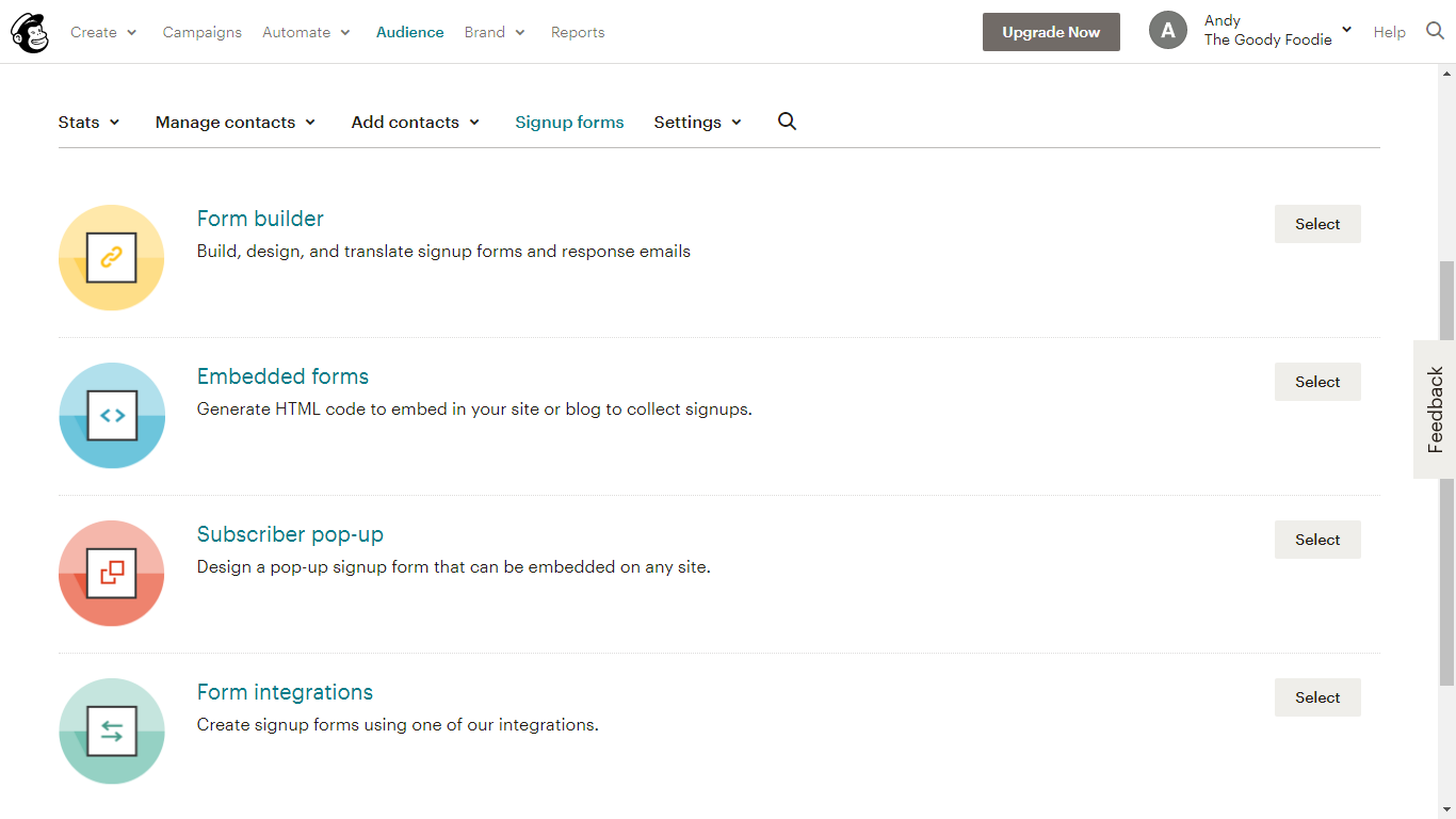
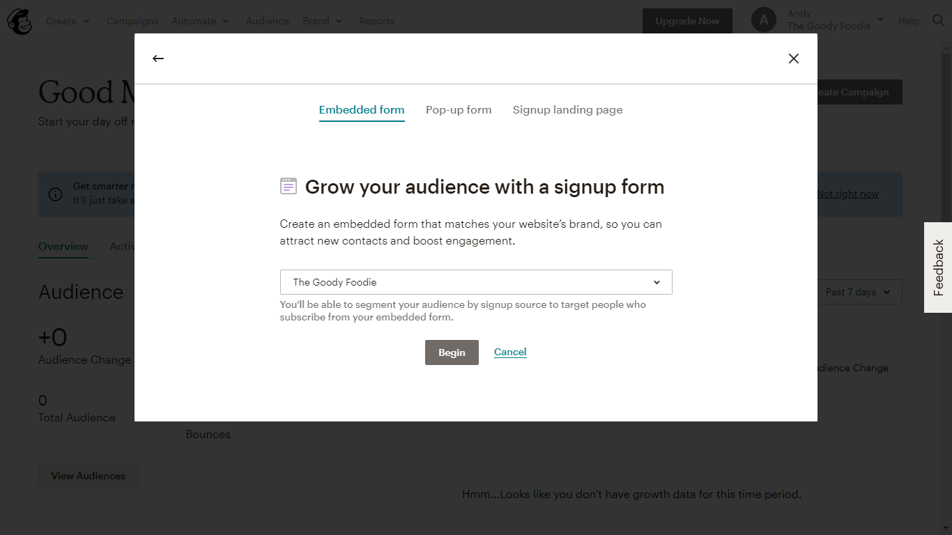
Step 2: Select the type of form you wish to create and assign the list where the visitor details will be collected.
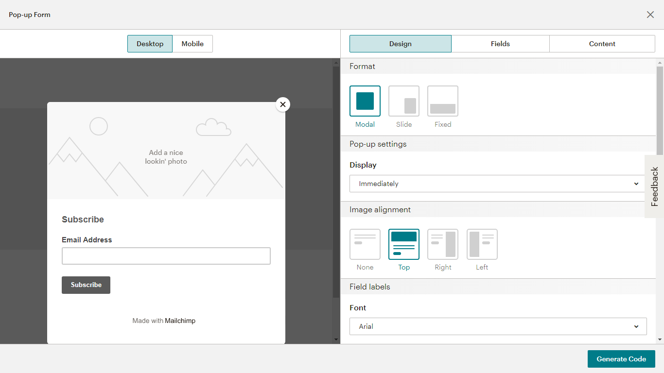
Step 3: In the form builder view, select the type of overlay you wish the form to possess. You can also change the display duration as well as edit the design of your signup forms.
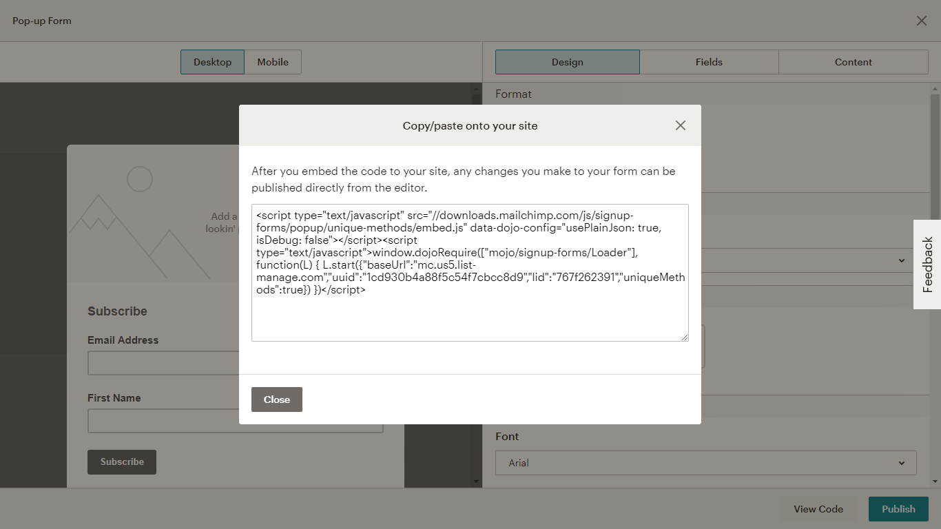
Step 4: Once you are satisfied with the overall result, click “Generate Code” and, depending on the type of form created, insert the code in the appropriate place. Now you are ready to build your mailing list.
What to Avoid While Creating Email Signup Forms
Poor Signup Trigger Timing: Timing is all-important for the email signup conversion. Time it too early or too late and your visitor may not engage further. For pop-up and static signup forms, it is better to display them after the visitor has spent 50 seconds to 1 minute on the page.
Too Many CTAs on the Page: Your visitor can be easily distracted if there are too many CTAs on the page. Multiple CTAs are an indication of poor planning which can reflect poorly on the brand.
Irrelevant Signup: This is a rookie mistake that most marketers fail to identify. A page might be talking about women’s shoes while the email signup form on the same page is getting information regarding men’s ties. Not only does this misaligned cause you to lose out on subscribers but also dilutes brand trust.
No Value Addition: As we stated earlier, the email signup needs to provide enough value for the visitor to give their email address in return. Failing to do so will result in poor performance.
Too Much Information To Subscribe: By asking too many questions, you can discourage the visitor from converting. Remember, the visitor only has to sign up from your form and register their profile.
Not Having a Periodic Backup of Your Mailing List: Your mailing list is the backbone of your business. Out of human error, if you manage to delete your mailing list, having Rewind backups can be your savior.
Wrapping Up
The email signup form is like the swiss-knife wherein you can attract leads, convert them with lucrative lead generation offers, and in turn, increase your overall sales. Place it on the most convenient location on your page where you can draw in maximum views. If your signup form is relevant to the audience, you will see your list building and growing many folds. This article covers list building for beginner to intermediate level, a MailChimp Expert (like QeInbox) can help you with advance list building as well as other aspects of email marketing.
Share any tips you have about effective list building techniques and start the conversation in the comment box below.


